She's been played on the radio and has played many live shows and I know she's already got a following locally. I recommend checking her out, you might just like what you hear.
Sunday, November 29, 2009
Aliciya Angel
Tuesday, November 24, 2009
Becky B. photo shoot.
I shot with the wonderful Becky again today. We went out to a field near sacramento and did some nudes as the sun set in the distance. I love shooting outdoors when the light is warm and low in the sky. I used a flash for fill but it was mainly the sun doing the lighting.
Post work was minimal, just some clean up and some curves. I toyed with the notion of black and white but I just couldn't stand to loose that beautiful warm sun light. in the end I'm glad I left it as is.
Wednesday, October 29, 2008
The lens myth explained

It's a common misconception that the shorter a lens, the more distortion the image will receive. And while this may seem like what happens based on what we see, the simple fact remains that it is the object's relationship to the field of view that affects the final representation in the camera.


If we can assume an object to extend out beyond it's edge on a plane lying perpendicular to the camera lens we can extrapolate the size of that object's plane in relationship to the field of view and further express that as a percentage of the camera's frame.
Basically, at any given distance from the camera we want to find out how long of a length is covered perpendicular to the lens. We can then use that information to determine the percentage that a given object has in relation to the fame size.
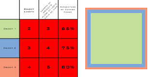
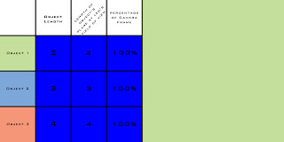
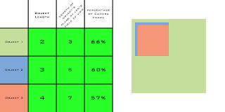
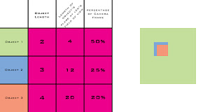
In the above diagram there are 4 "cameras" and 3 "objects". The red camera and the blue camera share the same field of view but a different position. The charts below show the effective size and the percentages of each of the objects in relationship to that specific camera's field of view.
The important thing to note is that while the objects remain stationary and their lengths unchanged, the relationship they exhibit to one another changes in a scalar form as the distance between the object and the lens changes. This is most apparent with the red and blue cameras which both share the same angular field of view with only a change in the distance from the objects.
As we move our position (the camera) from the position of the red camera to the position of the blue camera the difference in relationship of each of the objects to the field of view changes until eventually each of the objects has a 100% of the frame's size in which each object overlaps the one behind them totally.
Continuing on, as we approach the green and subsequently the purple camera positions the effect of each object in relationship to each other continues until we reach the point where the difference in each field of view becomes greatly distorted. At the point we reach the position of the purple camera the 2nd object which is 150% the size of the first object becomes distorted to appear to be half the size (or thinking of it in reverse, the smaller object appears twice as large as the (in reality) larger object.
This happens simply because the object fills less of the frame since it's relationship to the field of view represents a smaller percentage within the total coverage for an object at that distance.
(it should be noted that the view's for the green and purple camera's have a cut out in the top left 1/4 of the first object to show where the subsequent objects would fall in relationship. The blue and red cameras both show a representation of how the objects would stack normally)


What we can get from this is that in order for an object of the same size to fill the same amount of space in the camera's frame we must use a wider lens as we move closer and a longer lens as we move away. In fact, both the red camera and the green camera represent object 1 as 66% of the frame. This is evidenced by both the charts as well as the first diagram where the intersection of object 1's plane is shared by both the red camera and the green camera's field of view.
An interesting change in the relationship happens however if we were to move the purple camera to the position of the red camera (a distance 6 times as far). If we move the purple camera object one will fill 0.083 percent of the frame, object 2 0.093 percent, and object 3 0.1 percent of the frame. The reason this is interesting is that the relationship of the sizes of each object remains roughly equivalent. 66% is 83% of 80%, whereas 0.083% is 83% of 0.1%, therefore the relationship of objects at any distance remains roughly equivalent at any given field of view.
Friday, July 11, 2008
Photoshop 101 : Levels
Last week I went over how to set up a product shot using just a few supplies from around the house. Today I am going to work on some basic image control techniques. I would like to stress a small pet peeve I have about calling this editing or photoshopping; first is that editing is the process of selection, and second is that photoshop is not needed for any of the techniques below since most any photo manipulation software can do this.I mention that last one for those that are using photoshop elements or some other program, since the buttons and names may be different. If you aren't using photoshop or similar and would like to have a decent photo manipulating without any cost to you (and legally too), consider GIMP. I've not used it myself but it is an option to you. gimp.org
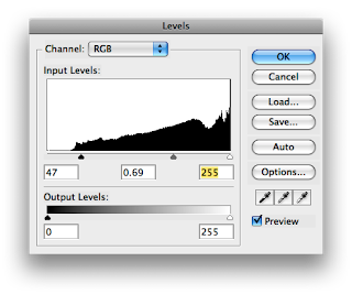
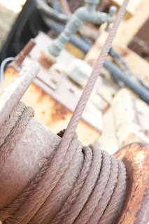
To begin our tutorial I am using a photo I took in a junk yard. Notice how the colors are lifeless and the photo is flat. For this exercise (and anytime you talk about photos), the term flat is used to denote an image that has low contrast, or range from darkest to lightest. A histogram such as the two in the levels control windows below shows a map of the concentration of values along the tonal range of the image. Sound complicated? It's not... Starting at the left of the histogram is the darkest spot and we get continuously brighter as we go further right. The far right is the brightest spot. The funny looking shape inside the window is the histogram itself, and is just a representation of the percentage of pixels that are that particular level of brightness.
Looking at the levels dialogs there are
three controls under the histogram, those little triangle are the controls we are going to use for this exercise. Now, I stress that using tools like auto levels may be a one click adjustment, but in my mind it is not a solution. Auto levels picks these points for you; we are here to learn how to pick them ourselves. To do this, we need to remember that the histogram is just a range of the current image's tones, the triangles on the bottom are where our white mid and black points will be after clicking okay.
Why is this important you may ask? Well, each image and hence each histogram is different and we want to be able to learn how to move the controls appropriately. Remember those bell curves from school where the teacher took the highest grade and the lowest grades and made those the tops and bottoms of the test and your grade fell somewhere between them? Well, that's what we're going to do with levels.

In my sample image's histogram above you can see how the image is not distributed evenly, it has very little in the darkest areas. What we've done is move the dark triangle to the right. We are effectively saying that this point above the triangle is where we want the bell curve to fall. In this case, we've moved the black triangle to just slightly past the first little bit of of the hill. Why did we do this? Because moving it into the area rather then just at the beginning will give us a slightly punchier contrast which is what we want.
I also moved the grey slider a little bit to, it controls the mid point of our bell curve. We usually want to adjust our mid points to control the contrast of our highlights OR our shadows. This one is also more subjective and depends on the individual image so you should play around with this one yourself.
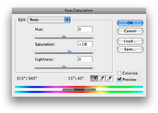
Lastly I felt that image looked fine tonally, but the color was a little lacking. So I opened up the hue/saturation tool and pulled in a bit more saturation here. BUT, in a step that is often over looked, I used the drop down menu to work on the red channel (and the yellow channel as well) since I felt the rest of the spectrum (blues and greens) looked fine. Here I added a small amount of saturation to the reds channel and yellows to bring out the rust of the cable and the yellow paint. This added a bit more pop to the image which to me was exactly what was needed.
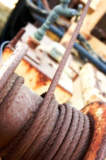
In looking at the image before we did any corrections to it to our final image we can see a huge increase in the image's tone and color. We started at a washed out flat image and ended up with something that has a full contrast range and has colors that pop. End the end, we've only used two tools and a few clicks of the mouse but we've had complete control the whole time. It may be a little more then clicking auto, but in this sample clicking auto would introduce a magenta color cast and leave us with a flat image.
I hope that this tutorial has provided you with some tips and a little more info on how to use photoshop to enhance your images. I'd love to see some before and after photos.
Tuesday, July 8, 2008
Photography 101 : Products

As an aide to those interested in shooting small objects such as jewelry or in this case a tape measure I'm going to start off my tutorials with a tabletop product shot demonstration. First thing I want to point out is I am in fact not using fancy equipment (other then my dSLR) to achieve this. Most of what you'll need you can find around the house already, or improvise where needed. So first, what is needed for this shot?
Materials:
1. Camera (any kind will do with one caveat, your life will be a million times easier if the camera has a manual mode. I'll go into this in a minute)
2. Product
3. Five sheets of typing paper
4. Table lamp.
5. Tripod (or something to rest the camera on)
6. Tape or 2 paper clips
Let's build our set shall we? First, take a sheet of paper and fold it in half widthwise. Then fold that in half what would have been lengthwise. Fold both sides of that to make a letter W (or M depending on which way you folded). You want to end up with a W shape however. Now, take another sheet of paper and tape the top edge to the arms of the W... You want this sheet to rest against your table and curve up in the back. This is the stage where your product will sit.

Take two more sheets of paper and fold each in half widthwise and set them on either side of the stage fold side up. Take your last sheet and make a small accordion fold along the center
lengthwise. Open it back up and smooth it out only a little (you should have a notch running down the paper, but you don't want it to high, this is only for structural support). Take this sheet and lay it on top of the two folded sheets on the sides, you should have the accordion fold facing up.
Take the table lamp, hopefully it's the kind that is on the arm that you can move around since what we want to do is put the light over the top sheet of paper. What we've done basically is create a tent with the product in the center. The sheet on the back swoops up so it looks like we have a white surface that goes on indefinitely, just what we want.
Place the camera on a tripod or other steady surface (we want the camera above the item and looking down on it). It helps to to back up and zoom in rather then stay close. Make sure you aren't catching any of the edges of the sheets. Having the camera on a tripod or steady surface helps to eliminate motion blur since we're not usually getting a ton of light from the lamp.

Now for that caveat I mentioned about the camera. You can get through this even if your camera doesn't have a manual (or at least exposure compensation) function. The problem is that we want to overexpose the scene. The camera takes an average of what it sees and guesses at the exposure. It tries to put this at a mid grey exposure, so that large area of white is going to look grey if you let the camera do it's thing without intervention. If we can let in more light now we can save ourselves some trouble in having to adjust it in the computer later. If your camera doesn't let you change the exposure we can adjust that in the next tutorial.
That's it. We've just taken our first product shot and if you've done everything right you probably won't need to do much post-processing work. If you do, we'll cover that in the next tutorial.
I would love to know if you use this technique, leave a link in the comments section.
Thanks, Paul
Subscribe to:
Posts (Atom)