Showing posts with label photoshop. Show all posts

Tuesday, June 19, 2012

how to retouch skin using frequency separation

When we retouch a portrait we want to maintain a realistic appearance by removing blemishes and smoothing out skin tone. Though we are often forced to sacrifice one for the other, frequency separation allows us to retain skin texture while softening skin tone. We can do this because we are working on each individually, separate from the other.
We're going to start of with a shot with some blemishes that we want to remove.


Our first step is to duplicate the background layer twice, for ease of identification an organization put the duplicate layers in a group and rename them. I've renamed the bottom duplicate layer color and the top one texture as well as renaming the group to retouch. This allows us to easily identify the layers we are working on and know what they're doing. At this point, hide the texture layer and select the color layer. Apply a slight blur to the color layer using gaussian blur, just enough to blur the fine details but don't go overboard with it. By hiding the texture layer we can see the effect of the blur on the color layer.
Moving on, we want to unhide and select the texture layer. Go to image - apply image. Your source is the file that you're working on. Under layer select 'color', and channel should be set to RGB.


If you're working with a 16 bit file use the following settings:
Invert: Unchecked
Blending: Subtract
Opacity: 100%
Scale: 1
Offset: 128

If you're working with a 8 bit file use the following settings:
Invert: Checked
Blending: Add
Opacity: 100%
Scale: 0
Offset: 0

Preserve transparency and mask should both be unchecked.

You should have a mid-grey layer with a faint outline of the image. You now want to changing the layer blending option to 'linear light' What this does in effect is create a layer that acts much like the unsharp mask filter, but since we've created two separate layers we can work on the color and texture of the image independently.

To do this, start by again hiding the texture layer and selecting the color layer. I find it easier to start by retouching the color layer without texture so we can see just the effects of the color. Smooth it out using the clone stamp tool or your other favorite method, we want a layer that has even and smooth skin texture with soft gradations in the shadows and highlights. Make sure if using the clone tool that your source is set to current layer. This is why we use a small blur initially, so as to preserve some of the fine edges such as boundaries between the lips and skin or eyes. Once we are satisfied with the color we can unhide and select the texture layer and clean up the texture using the same technique.

Our final image should have a smooth skin but still retain the texture of skin. It's important for the realism of the portrait that there is still texture such as pores, a blurred skin looks fake and should never be acceptable. Using the frequency separation technique outlined here can provide high quality results and can be done quickly. Total time for me on this sample was around 6-7 minutes.

Compare the original photo above to the final retouched version by clicking on either for a larger image.


Wednesday, February 22, 2012

Veronica


Went down to the river today with the lovely Veronica and got some great shots.  Playing with my new lenses and trying out some new lighting as well.  Overall it was a great shoot and I'm excited to have some new photos to post.

Friday, July 11, 2008

Photoshop 101 : Levels

Last week I went over how to set up a product shot using just a few supplies from around the house. Today I am going to work on some basic image control techniques. I would like to stress a small pet peeve I have about calling this editing or photoshopping; first is that editing is the process of selection, and second is that photoshop is not needed for any of the techniques below since most any photo manipulation software can do this.

I mention that last one for those that are using photoshop elements or some other program, since the buttons and names may be different. If you aren't using photoshop or similar and would like to have a decent photo manipulating without any cost to you (and legally too), consider GIMP. I've not used it myself but it is an option to you. gimp.org

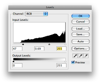
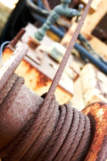
To begin our tutorial I am using a photo I took in a junk yard. Notice how the colors are lifeless and the photo is flat. For this exercise (and anytime you talk about photos), the term flat is used to denote an image that has low contrast, or range from darkest to lightest. A histogram such as the two in the levels control windows below shows a map of the concentration of values along the tonal range of the image. Sound complicated? It's not... Starting at the left of the histogram is the darkest spot and we get continuously brighter as we go further right. The far right is the brightest spot. The funny looking shape inside the window is the histogram itself, and is just a representation of the percentage of pixels that are that particular level of brightness.


Looking at the levels dialogs there are
three controls under the histogram, those little triangle are the controls we are going to use for this exercise. Now, I stress that using tools like auto levels may be a one click adjustment, but in my mind it is not a solution. Auto levels picks these points for you; we are here to learn how to pick them ourselves. To do this, we need to remember that the histogram is just a range of the current image's tones, the triangles on the bottom are where our white mid and black points will be after clicking okay.

Why is this important you may ask? Well, each image and hence each histogram is different and we want to be able to learn how to move the controls appropriately. Remember those bell curves from school where the teacher took the highest grade and the lowest grades and made those the tops and bottoms of the test and your grade fell somewhere between them? Well, that's what we're going to do with levels.

In my sample image's histogram above you can see how the image is not distributed evenly, it has very little in the darkest areas. What we've done is move the dark triangle to the right. We are effectively saying that this point above the triangle is where we want the bell curve to fall. In this case, we've moved the black triangle to just slightly past the first little bit of of the hill. Why did we do this? Because moving it into the area rather then just at the beginning will give us a slightly punchier contrast which is what we want.

I also moved the grey slider a little bit to, it controls the mid point of our bell curve. We usually want to adjust our mid points to control the contrast of our highlights OR our shadows. This one is also more subjective and depends on the individual image so you should play around with this one yourself.

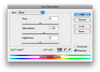
Lastly I felt that image looked fine tonally, but the color was a little lacking. So I opened up the hue/saturation tool and pulled in a bit more saturation here. BUT, in a step that is often over looked, I used the drop down menu to work on the red channel (and the yellow channel as well) since I felt the rest of the spectrum (blues and greens) looked fine. Here I added a small amount of saturation to the reds channel and yellows to bring out the rust of the cable and the yellow paint. This added a bit more pop to the image which to me was exactly what was needed.

In looking at the image before we did any corrections to it to our final image we can see a huge increase in the image's tone and color. We started at a washed out flat image and ended up with something that has a full contrast range and has colors that pop. End the end, we've only used two tools and a few clicks of the mouse but we've had complete control the whole time. It may be a little more then clicking auto, but in this sample clicking auto would introduce a magenta color cast and leave us with a flat image.

I hope that this tutorial has provided you with some tips and a little more info on how to use photoshop to enhance your images. I'd love to see some before and after photos.